


 Random thoughts on decor
 Who says red and pink don't go together?
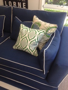
 Blue fabric and more blue
 Feeling grey, grey, grey today
  A perfect room
 Why grey is the best colour
 Some latest finds..
 Neutrals and classics
 Floor plans and country cottages
 More of the best breakfast nooks
 Amazing before and afters
 Shapely upholstered bedheads
 Decorating with black
 A snippet of my week and a lovely bedroom
 Colourful ikat chairs
 Friday taste of Tropicana
 Purple in every shade
 Wonderful decorating day
 A glamorous grey abode
 On today's wishlist..
jeffers design group
Isn’t this bathroom amazing? Every detail is gorgeous, from the mirrored sink cabinet, to the grey granite top, stone sink, sconces and venetian mirror above. But the real showstopper, of course, is the pink and aqua pattern on the walls! Not sure if it’s a painted finish or a wallpaper, but I love the colours. It reminds me of this Kate Spade ad that I’ve had saved for awhile for colour inspiration - I also love the vintage feel of it:

kate spade
And while I’m in the mood for it, why not add in a turquoise rug;

madeline weinrib rug
and some pink trim;
and maybe even a rustic-style co-ordinating lamp?

recycled lamp
And, because a room is never complete without books and artwork, an abstract painting to suit my scheme! xx

michelle adams
(contact me to order any of the above)
 Bookmark on Delicious
- Digg this post
- Recommend on Facebook
- share via Reddit
- Share with Stumblers
- Tweet about it
- Subscribe to the comments on this post


