


 Feminine Style
 Victoria Hagan for Target
 A yellow and grey living room
 Neutrals and bookshelves
 From the trade fairs and beyond..
") Just because it's beautiful...(and French)
Just because it's beautiful...(and French) Colours combined: Pink and Brown
 A living room work-in-progress
 Look familiar?
 Latest ebay find and Mother Nature
 Happenings
 Saturday House of Inspiration - country dream home
 Highlights from Lonny
  An accent of Sunshine
 Shades of purple loveliness
 Red and more red
 Carolyn's new house part 1
 Choosing pendant lighting..
 Purple in every shade
 More shopping
Hello! Well I can’t believe it’s April and this is my first post of the year! It’s amazing how quickly these past few months have gone by, and though I haven’t been on the blog I’ve appreciated keeping in touch with several of you, my lovely and patient readers, via email while I’ve been busy doing other things. Life and work have been full and busy, and there are lots of exciting projects in the pipeline, which I’ll post about here in the coming weeks. We are also seriously house-hunting (yes, still), so I hope that my own renovation project will be on the cards pretty soon.
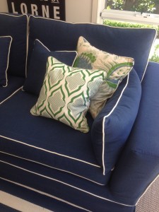
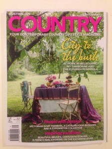
The magazine came out a couple of days ago, but it wasn’t until today that I managed a trip to the newsagent to pick up a few copies of the current issue (May/June) of Australian Country, which features the home of some clients for whom I had the pleasure of working last year. This is as good a reason as any I think to get back onto this blog! It’s very exciting to see this lovely home in print. Below are a few of the pics from the magazine, but pick up a copy to see the whole spread. I’ll also be adding some extra photos not seen in the magazine to my Portfolio page.


Because of my hiatus I have a whole lot of thoughts and photos I’ve been saving up and will need to share to stay sane! So I promise I won’t disappear for another three months…
Naomi xx
 Bookmark on Delicious
- Digg this post
- Recommend on Facebook
- share via Reddit
- Share with Stumblers
- Tweet about it
- Subscribe to the comments on this post


