


 Today, I'm looking at..
 Saturday House of Inspiration - David Lawrence
 White
White Pales and greys
 Room planning and house hunting
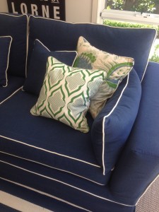
 A new colour fave: blue and green
 Latest bargain finds
 Statement Art
 Shades of Blue
 Why grey is the best colour
 It's all in the detail
 My kind of Hamptons style
 World's most beautiful bathroom and office?
 Feeling grey, grey, grey today
  Praying for Japan
 All things Betsey Burnham
 Ebay finds and Blue and White
 Sunday
 Crazy for red and pattern
 I love purple-grey
As I posted about art yesterday I thought I’d share a few more rooms where the focus is on the amazing artwork. The room above is one of my favourites, because of the colour scheme but also because of the mix of styles and shapes. It mixes geometrics (box pleating on chair upholstery, rug) with curly, feminine lines (side table, curtain fabric, wall sconces) and the textured, industrial style of the painting. It’s something unexpected, like pairing pink chairs with polkadots with this rough, masculine painting that to me can makes a room successful.
 Beautiful pastels, where the painting is the focal point of the room (above).
 I threw this one in for my friend Kimberley, who’s a doggy person (plus, how cute is this? Art doesn’t need to be serious!).
 Love, love the impact of this giant painting, and of course all the greys (above).

 This is such a fun, happy room and I love the big, bright animal painting for a family room!

 I think this piece (above) is beautiful and really interesting - I’m wondering if when my kids are a little older I could give them a giant canvas and ask them to paint their version, because to me it really looks and feels like a story told in pictures.
 Love the blues here and the ‘map’ carpet, but also how the wall appears to be part of the overall piece (above).
 I absolutely adore large-scale photos as a statement art piece, and I posted about it here.
 I’ve had this picture saved for ages (above), because it appeals to me so much- the dark grey walls are a great backdrop for the bright painting, but also love the mix of furniture and the mirror reflecting the potted tree.
 How pretty is this (above)?
 Every now and then I go through a real modern Scandinavian-inspired period where I crave a dining room just like this (above). Love that painting!
 Bookmark on Delicious
- Digg this post
- Recommend on Facebook
- share via Reddit
- Share with Stumblers
- Tweet about it
- Subscribe to the comments on this post


