


 A little of my week
 A yellow and grey living room
 Saturday House of Inspiration - Rue
 Lovely Blue and White
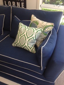
 Blue fabric and more blue
 Seafoam and duck egg blue
 Rugs and ideas
 Blues and pretty things
 Fab designer home..
 Rustic Industrial Style
 The Brown Trading Co. and amazing DIY
 Room planning and house hunting
 Thinking of a Home Office
 Today in fabrics
 My morning and some decorating bargains
 A white Farewell
 Christmas Stockings
 Sunshiny blue day
") Vintage Whites and Taupe (Country Living)
Vintage Whites and Taupe (Country Living)

martha stewart living
m and co


As much as I love bright colour I’m also always drawn to pastels and classical displays of beautiful things. Martha Stewart is really the Queen in my book of subtle muted colours used in elegant displays. I remember many years ago looking through my mum’s interiors magazines and being mesmerized by Martha’s home (can’t remember which one it was now but I remember the big white sink and her penchant for round tables stacked with books and topped with small objects d’art!).
Anyway, it’s been a busy week and I’m greatly looking forward to the school hols that start early tomorrow afternoon, spending time pottering at home with the kids and doing some cooking (still tons of lemons to use). Nothing like cold weather to make one think about food, food and more of the same!
 Bookmark on Delicious
- Digg this post
- Recommend on Facebook
- share via Reddit
- Share with Stumblers
- Tweet about it
- Subscribe to the comments on this post
What beautiful images thank you. Love the first one - just so serene and stylish. Also was/am in awe of Martha…we lived in the US for a while and I was so excited that I could access her paint colours. I still have the charts in my files and the styling pics are still relevant 12 years on. Have a lovely weekend. Annie x.
Hi Annie, yes there’s certainly a lot to be said for colours/styling that can stand that test of time! x