I have been obsessed with the idea of having a blue library for awhile now. I love the idea of being wrapped in a dark colour for reading/watching tv, and am detrmined that when (someday) I have a separate room in my house for all the books which are currently stored in boxes in our garage, it will be all blue! This is my dream room (I am picturing the other walls are covered in bookshelves):

elle decor
My three favourite colours all in one gorgeous room: grey, blue and purple. I am soo in love with the walls covered in framed pictures, too. I like that it’s not too matchy-matchy, that the sofa is painted white, but the chair is natural timber, and that there’s a hint of gold.

house beautiful
This is another favourite (above) by Ashley Whittaker. I like the way the ‘library’ is (in my mind) one end of an open-plan room, which is delineated by the table behind the sofa. An it reads as a wide room, though the sofa and chinese table are actually quite narrow. The floral chairs and blinds keep it casual and happy.
This library is such a dark shade of blue (above) that it could easily feel like a formal, serious rom. That fab bird painting and the blue and white zebra fabric keeps it young and fun.

elle decor
Where can I get a pair of those amazing tan leather and chrome chairs?

ashley whittaker
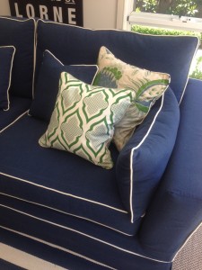
This is a great way to introduce blue at home, without going for the full ‘blue library’ effect: Paint your bookshelves blue to tie in with the fabric on an armchair. It looks cohesive but very casual and fresh.

elle decor
I remember being fixated on this house (above) the month it appeared in Elle Decor magazine. The owner described (from memory) this room as being painted a ‘greyhound blue-grey’ which is exactly what it looks like! Again, love those colours - grey,blue, purple and this time, a pop of bright pink. I also love the fun rug - the owner dyed the rug herself using purple fabric dye. So fabulous!

living etc
Modern-style book heaven!


 Warm rooms and high ceilings
 A perfect room
") Just because it's beautiful...(and French)
Just because it's beautiful...(and French) A city townhouse high on style
 Architecture and Mood
 Carolyn's new house Part 2
 Time-worn and beautiful
 Decorating Dilemma - Octagonal Mirror
 A relaxed country/beach house
  Some latest finds..
 Perfect picture walls
 Crazy for red and pattern
 A white Farewell
 Antique shopping in Sydney
 Monday at my house
 Style from Nature
 Saturday House of Inspiration - Rue
 Mother's Day
 The pinks have it
 Latest finds on ebay
 Bookmark on Delicious


